
The Historical Overview lane is really pretty simple, but ripe with important information:
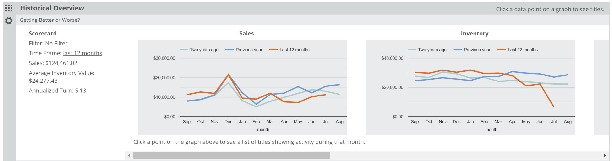
You can quickly see, for whichever account you’ve selected and any Saved Filter, monthly Sales, Inventory, Turns, and Unit Sales levels for the last few years (for your titles only). As the labels on the graph indicates, the red line represents the last 12 months and the blue line represents the 12 months previous. Assuming we have that amount of data from your account(s), you’ll see at a glance how all, or a specific portion of your titles have been performing at this store for the last few years.
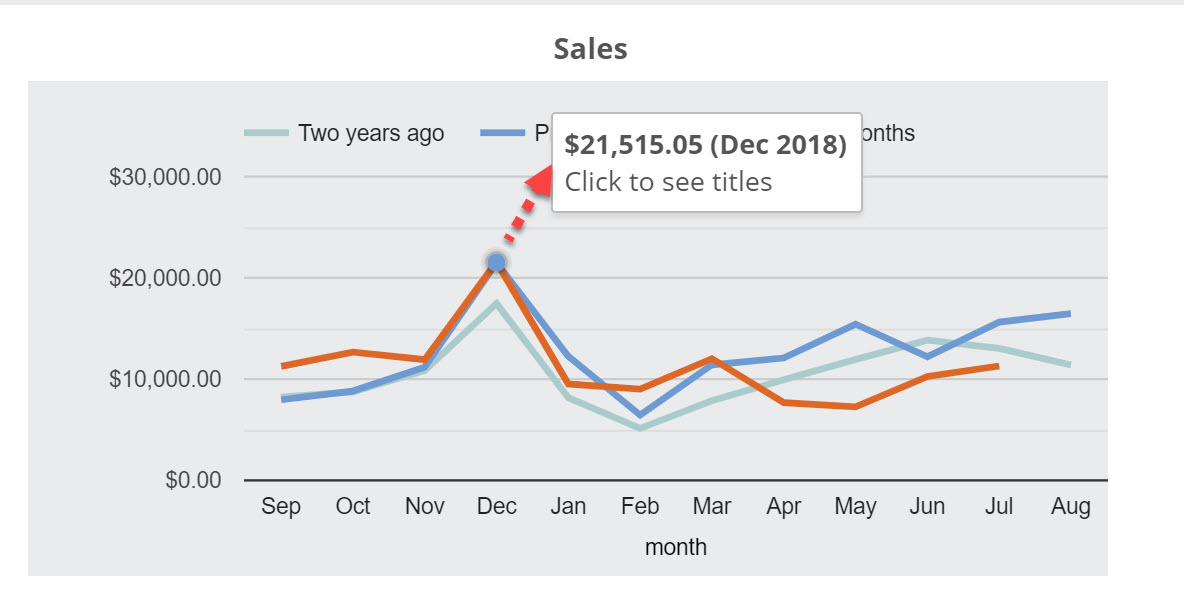
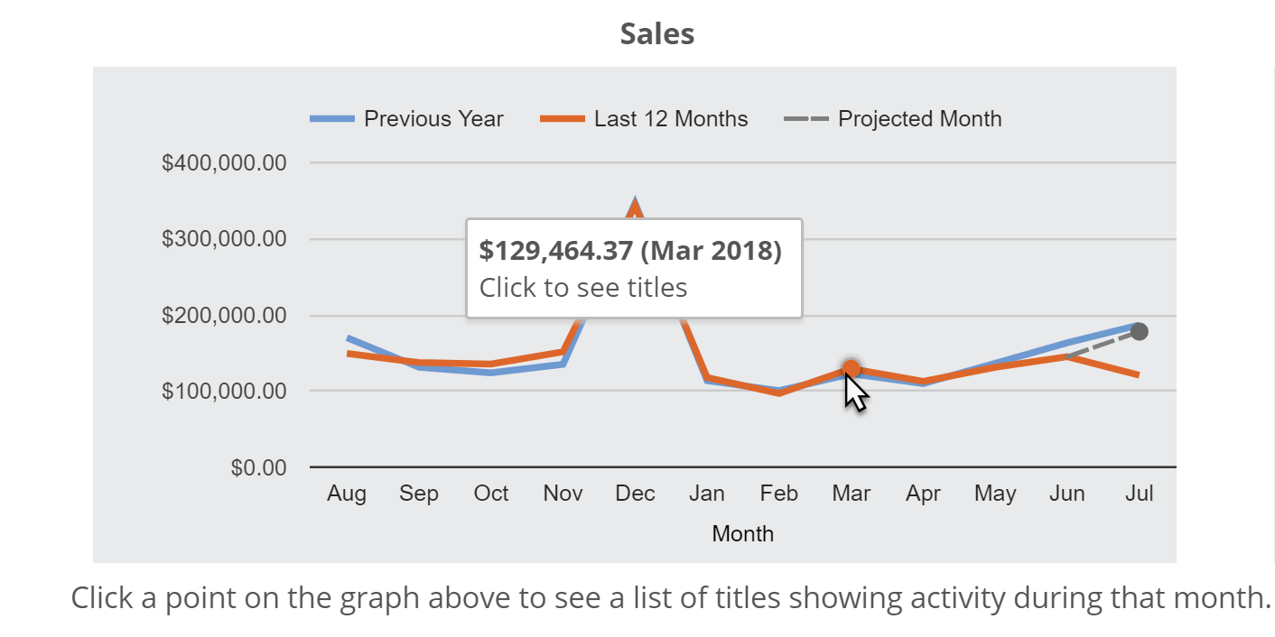
Hover over a spot on the graph to get the total activity of that month:
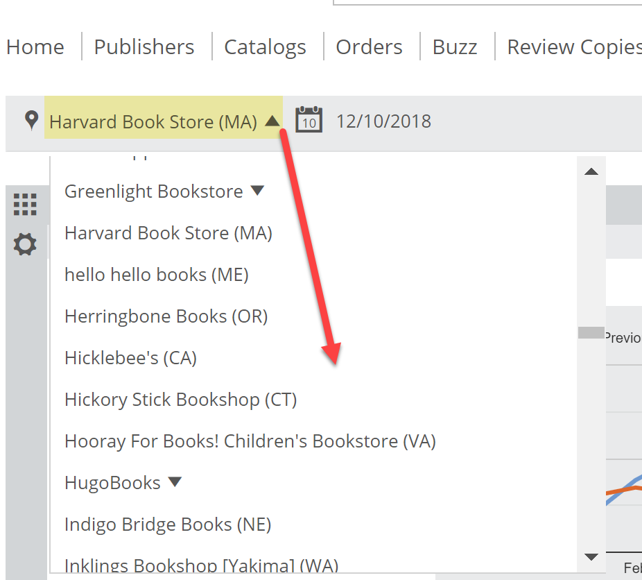
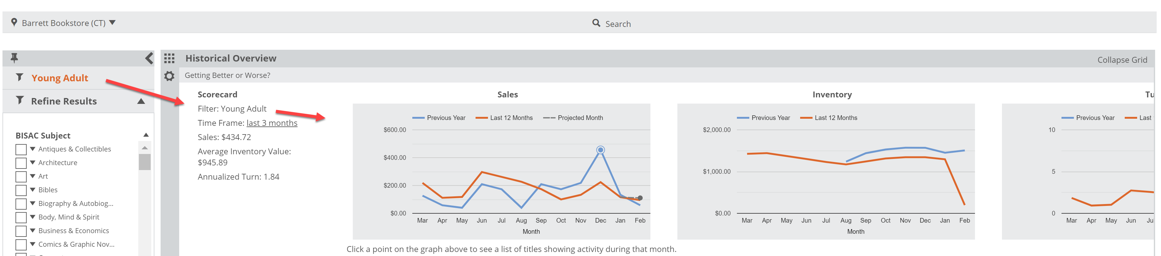
You can view specific accounts using the Location Selector at the top of your Analytics page:
And as mentioned above, your Saved Filters will customize your Historical Overview graphs. For example, you can see how sales, stock, and turns have trended for your Young Adult titles at an account over the last 2 years:
Click any month to get a list of relevant titles for that month’s activity. For example, click to see which specific titles sold in December, along with all the rich market and title data for those titles:
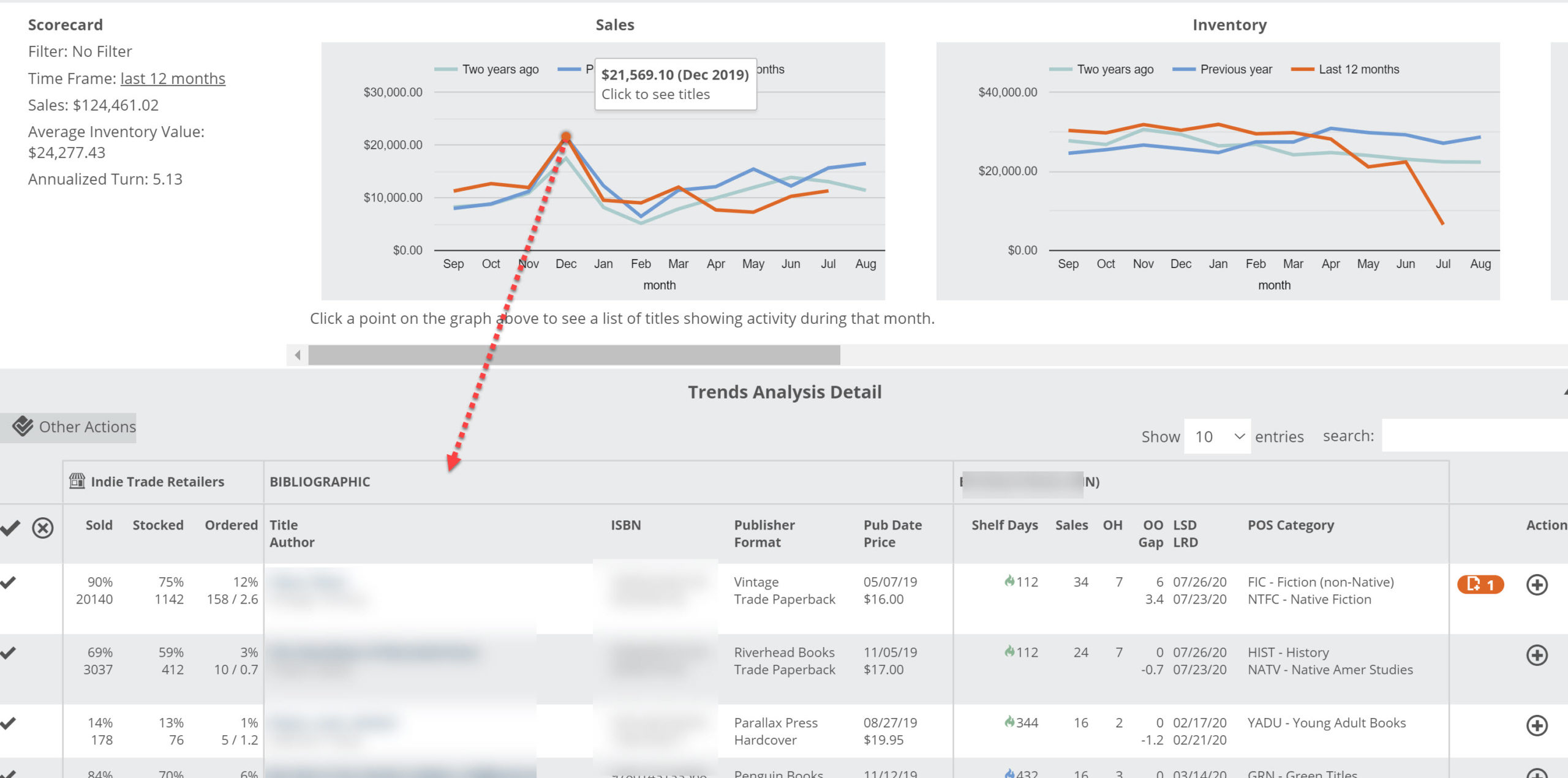
You’ll see graphs for Inventory (average gross), Sales (total gross), Turns (Sales/Inventory), and Unit Sales (total number of items sold per month).