
The charts and graphs in Edelweiss Analytics show activity based on a customizable Shelf Days measurement, which allows you to set your own parameters for what you would consider high and low-performing titles.
Shelf Days are based on a simple calculation:
(Copies On Hand) X (Days Since Last Activity)
This calculation creates a simple index number that can quickly let you know how a title is ‘performing’ at your accounts. For example, if they have 4 copies of a title on hand, and sold a copy yesterday, you’ll see a nice and low index number of “4.”
(4 copies) X (1 Day Since Last Activity)
Conversely, if they have 4 copies on hand and last sold a copy a year ago, that title’s index number will be “1460” (4 copies on hand) x (365 days since last activity)=1460. That 1460 would indicate that this title is relatively stale and either a return or even some simple in-shop merchandising might be in order.
The idea is that you can set the graph to portion out a store’s inventory according to title ‘performance.’ Fresh/Hot titles have not been sitting for long without some positive action, while stale titles have been languishing for quite some time. Since this can be a relative distinction, you’re in control of these values in your Analytics graphs.

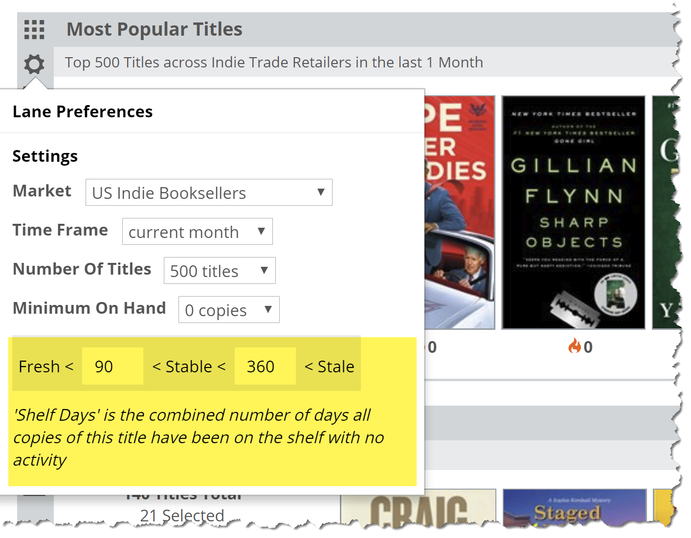
The default “Fresh” index is set to “90.” This would be a single title that has been sitting on the shelf for less than 3 months, or a title with 5 copies that have been on the shelf for less than 18 days…or a title with a dozen copies on hand that has been on the shelf for about a week. The more copies of a title stocked, the more “urgent” the situation, so to speak, as your account made a much larger investment in that title. To justify that investment (and, arguably, to argue for future large investments), that stack of books should really be moving out the door.
You’ll likely find that you’ll fine-tune these distinctions according to your personal preferences as you work with these tools.
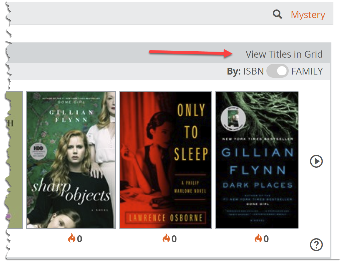
Based on the Shelf Days parameters you set, your pie graph will portion out those 200 titles, in the above example, according to how they’ve performed. So, new and recently sold titles will show as “In Stock-Fresh/Hot,” while those titles that have been idly languishing will show as “In Stock-Stale/Cool.” You will also see titles that show as “In Stock-Stable”, “Not in Stock,” and “Not In-On Order.” Your dashboard lane will show a sampling of the titles that fit these descriptions. You’ll see a color-coded flame icon with a circulation index number under each title. Hovering your mouse over that number will give additional detail about that particular title.

As mentioned above, in each of the different dashboard lanes, you can customize how your account’s stock of your titles sort out according to Shelf Days. Here’s an example from the Most Popular Titles lane:
When you’ve selected the group of titles you’d like to view in the resulting graph, you can click this View Titles in Grid link to see details. The results are sorted according to Shelf Days by default.
This will show you a detailed list of titles and their Market data, as well as data:
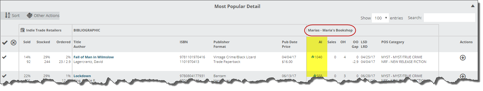
Find details about reading this graph here.